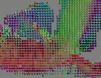
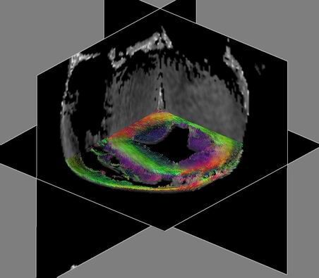
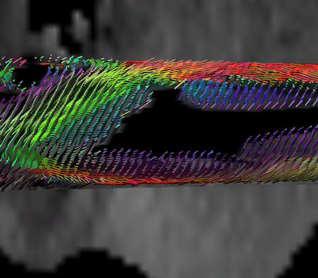
Next: Rendering Up: Method Previous: Computations

Visualization

We use two major techniques to visualize tensor data - glyph based visualization and fiber tracing. We notice [Worth et al. 1998] that three-dimensional boxes used as glyphs in the complicated tensor fields convey information better than ellipsoids. We apply box-based visualization to the short axis (axial) slice of the data. The results are shown in Fig. (2), where boxes are scaled according to $(\lambda_1,\lambda_2, \lambda_3)$ eigenvalues and oriented according to corresponding eigenvectors. As seen in Fig.(2), left and middle images, boxes have almost equal sides, i.e. in our data first eigenvalue is only slightly larger than the second and third (see Discussion Section). In order to visually enhance the directionality of the field we use $(\lambda_1 -\lambda_3, \lambda_2 - \lambda_3,
\lambda_3/10)$ for scaling factors in further visualization. (see Figs. (2-3)). In the fiber visualization, fibers are grown along the ``largest eigenvector'' - the eigenvector corresponding to the largest eigenvalue of the regularized continuous tensor field. The integration step size is taken to be $0.1$ of the data voxel size and the moving filter covers $1$-$3$ of neighboring voxels. The seeding regions for the fibers are chosen to be a thick ($10$ voxels) vertical slab going through the center of the dataset and with width and height covering the entire data volume. The seeding points are located on a regular grid $\{20$ x $20$ x $5\}$ within the slab, but the lines start only from the points with $c_p + c_l > \epsilon$, with $\epsilon = 0.1$ for this dataset. For more details and explanation of the fiber tracing technique see Zhukov and Barr Zhukov02. We employ several distinct color-mapping schemes for visualization. We use direct RGB $\rightarrow$ XYZ mapping for all glyph based visualization and some of fiber tracking results. In this scheme, the elements oriented along the X axis are colored red, along the Y axis - green and Z axis - blue (see Figs. (2-4)). For heart muscle visualization, it is important to be able to distinguish between clockwise and counter-clockwise orientation of spiraling fibers corresponding to left and right handed spirals. To emphasize that difference, we developed two color-mapping schemes. The first one classifies fibers according to the chirality (right or left handedness) without taking into account the value of the pitch. All fibers with the same chirality are colored the same way. Such color-mapping is useful for classification purposes, but creates abrupt changes in color (singularities) on the boundaries (see Fig. (5)). The second method adds the pitch angle to the scheme and allows the mapping to smoothly blend colors from the most saturated, corresponding to the pitch angle of $45$ degrees, to neutral for horizontal and vertical fibers (see Fig. (6)). Both color-mapping schemes rely on the same idea: after choosing an axis of rotation for the spiral one can determine its chirality by comparing the z component of the cross product between the radius vector and tangent vector to the fiber at the chosen point and the z component of the tangent vector itself. Mathematically, if ${\bf r}$ the radius vector pointing to the element and $\mathbf{\tau}$ is a tangent vector at the point, then
\begin{displaymath}
g = {\mathbf \tau}_z \cdot ({\mathbf r} \times {\mathbf \tau})_z
\end{displaymath} (5)

If $g>0$, it is a clockwise (right handed) spiral, otherwise it is counter-clockwise (left handed).
Figure 2: Glyph-based visualization of the the raw data tensors. RGB colors correspond to XYZ components of the largest eigenvector. Boxes are oriented according to eigenvectors and scaled by eigenvalues. For example, red boxes are oriented along the red (X) axis. Blue boxes correspond to the vertical muscle fibers in the inside the ventricle. From left to right: axial slice of the data; magnified region from the left image; the same region with enhanced scaling for the glyph boxes emphasizing principal direction. Note the transition from the red boxes along the X axis to the green boxes, parallel to Y axis. This transition follows the direction of the heart muscle fibers.


Figure 3: Glyph based visualization of diffusion tensor shown on the background of anisotropy measure: left - the entire dataset; right image - zoomed in view. Notice the vertical (blue) component of the boxes and the ``flatter'' orientation of the red boxes.


Next: Rendering Up: Method Previous: Computations
Leonid Zhukov 2003-09-10